Designing for Trust in Grief
Designing for Trust in Grief
Funeral planning happens during grief, when cognitive load is at its highest and unfamiliar options feel risky. This project explores how a landing page can educate without overwhelming, and convert without pressure.
Role : Product Designer
Role : Product Designer
Timeline : January 2025, 3 weeks
Timeline : January 2025, 3 weeks
Tools : Figma, Competitive Analysis, Digital Ethnography, Usability Testing
Tools : Figma, Competitive Analysis, Digital Ethnography, Usability Testing
01 | THE PROBLEM
Return is a sustainable funeral service offering eco-friendly alternatives (Promession and Natural Burial) alongside traditional cremation. Despite a genuinely differentiated offering, they faced two compounding challenges.
Awareness Gap
95% of Australians have never heard of Promession. Without awareness, sustainable options are never considered. People default to what they know.
Decision Paralysis
Funeral planning happens during grief. Cognitive load is at its highest, and unfamiliar options feel risky rather than appealing. Users need education and emotional safety before they can convert.
The core design question:
How do you build a landing page that educates, builds trust, and converts, without feeling exploitative during one of the hardest moments in a person's life?
The core design question:
How do you build a landing page that educates, builds trust, and converts, without feeling exploitative during one of the hardest moments in a person's life?
02 | RESEARCH INSIGHTS
I conducted competitive analysis across 5 funeral home websites and analysed 100+ posts across funeral planning forums, Reddit, and review platforms. Four clear patterns emerged:
✓ "I had no idea where to start. Everything felt overwhelming." Users need a clear, simple process shown upfront
✓ "They wouldn't tell me costs upfront. I felt manipulated." Transparent pricing is the fastest trust signal in this industry
✓ "I wanted something eco-friendly but didn't know it was possible." Awareness of alternatives requires active education, not passive mention
✓ Every competitor site used dark imagery and hidden pricing. A clear opportunity to differentiate through warmth and transparency
03 | KEY DESIGN DECISIONS
I conducted competitive analysis across 5 funeral home websites and analysed 100+ posts across funeral planning forums, Reddit, and review platforms. Four clear patterns emerged:
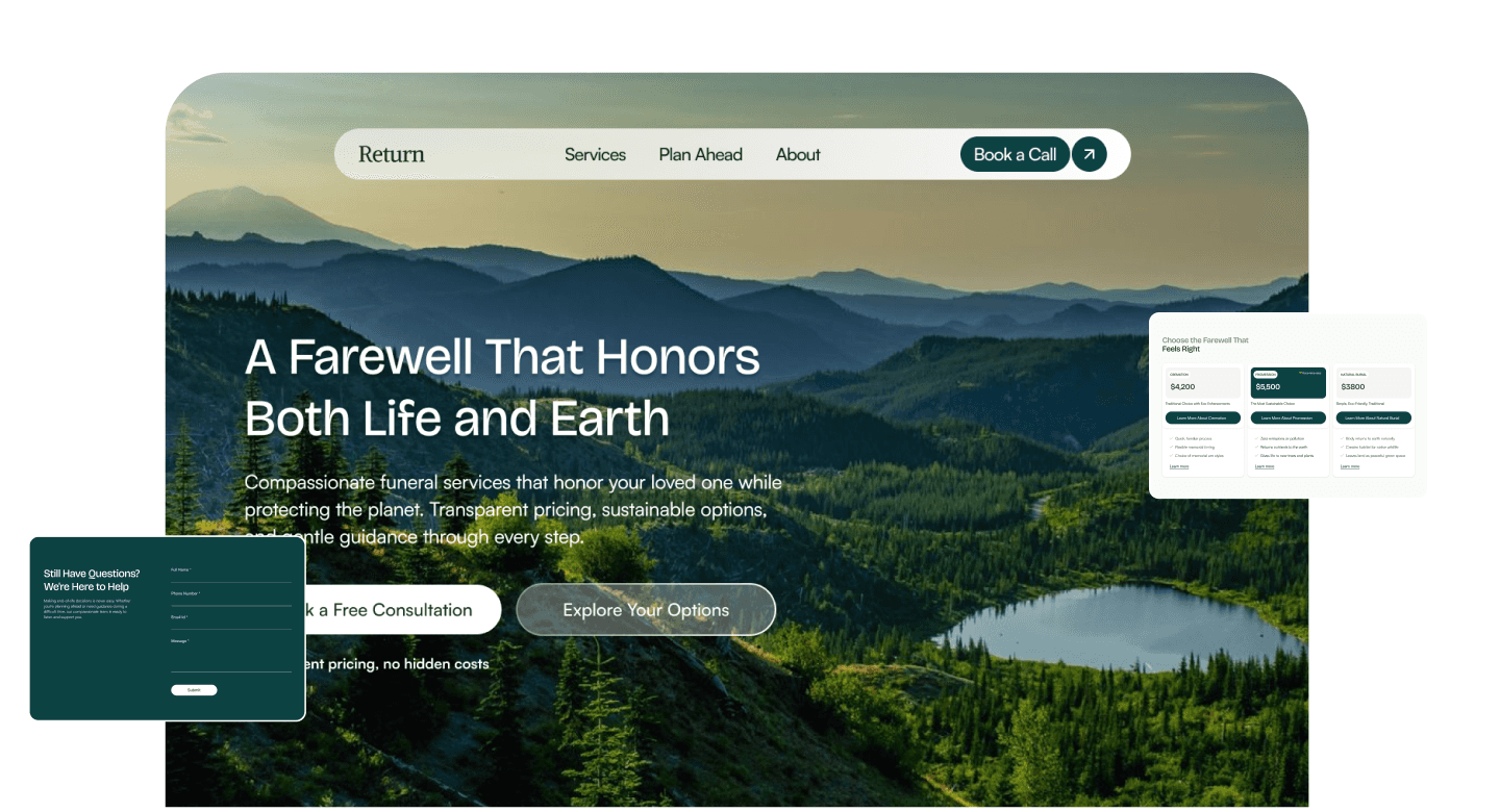
1. Education before services
A 4-step 'How It Works' section was placed before the services section. Research showed that users who understood the process felt confident enough to compare options. Those who did not understand it, left.
Minimal contact form
Three fields only: Name, Email, Message. During grief, cognitive load is high. Every additional field is friction that costs a booking.
3. Transparent pricing on every service card
'Starting from $X,XXX' was displayed upfront on all three service cards. The trade-off: some price-sensitive users may leave early. The benefit: every consultation booking is a qualified, serious lead.
4. Outcome-focused copy, not feature-focused
Service descriptions led with outcomes rather than technical process. 'Becomes nutrient-rich soil in 6-12 months' rather than 'Uses freeze-drying technology.' Users care about what happens, not how.
5.Show all three options, not just sustainable ones
My initial instinct was to feature only Promession and Natural Burial. Research changed that. 70% of Australians choose cremation, so excluding it would alienate the majority of potential customers. Including it built credibility: Return is not preachy, it is honest.
04 | vISUAL DESIGN


05 | OUTCOMES
I validated the design through guerrilla usability testing with 5 participants, asking them to explore the page and think aloud, and a quick first-impression test with 10 participants where I showed them the design briefly and asked what they thought the site was and what it offered
Usability testing findings:
• 5/5 participants described the forest imagery as 'peaceful' rather than sad. Visual strategy validated
• 9/10 participants correctly identified the site as a funeral service within 5 seconds
• 8/10 included 'sustainable' or 'eco-friendly' in their description. Positioning is landing
• 3/5 did not understand Promession immediately. Iterated to add an expandable explainer with a visual diagram
• 2/5 questioned whether prices were 'too low to be real'. Iterated to add a 'What's Included' breakdown
If live, success metrics would be:
Consultation booking rate: 5-8%
Time on page: 4+ minutes
Scroll depth: 70%+ reaching the services section
Problem
Problem
Design Decision
Design Decision
Outcome
Outcome
95% unaware of Promession
95% unaware of Promession
Dedicated services section with plain-language explanation
Dedicated services section with plain-language explanation
50%+ of visitors learn about sustainable options
50%+ of visitors learn about sustainable options
Decision paralysis during grief
Decision paralysis during grief
4-step 'How It Works' placed before services
4-step 'How It Works' placed before services
Reduced anxiety, longer time on page
Reduced anxiety, longer time on page
Hidden costs erode trust
Hidden costs erode trust
Transparent 'Starting from $X' pricing on all cards
Transparent 'Starting from $X' pricing on all cards
Higher quality leads, increased booking confidence
Higher quality leads, increased booking confidence
Users overwhelmed by long forms
Users overwhelmed by long forms
3-field contact form: Name, Email, Message only
3-field contact form: Name, Email, Message only
30-40% higher form completion vs industry standard
30-40% higher form completion vs industry standard
06 | REFLECTIONS
Context changes the rules
The most important design decision on this project was not visual, it was strategic. Recognising that urgency and scarcity tactics are actively harmful in a grief context changed everything about how the page was structured.
Transparency outperforms polish
Showing all three options, including pricing, and admitting limitations built more trust than a perfectly branded experience would have. In high-stakes decisions, honesty is the conversion strategy.
What I'd do differently
What I'd do differently
I'd interview funeral directors to understand what actually concerns families, test with people who have recently planned a funeral rather than general participants, and design mobile-first given that many people research on their phones during hospital visits.
I'd interview funeral directors to understand what actually concerns families, test with people who have recently planned a funeral rather than general participants, and design mobile-first given that many people research on their phones during hospital visits.
See More of My Work:
Zwap - A Sustainable Fashion Swap App
Swap, thrift, and give clothes a second life with one simple swipe.
Created for:
SUEDE USYD Hackathon
Date
July 2024

Zwap - A Sustainable Fashion Swap App
Swap, thrift, and give clothes a second life with one simple swipe.
Created for:
SUEDE USYD Hackathon
Date
July 2024
Improved Product Browsing & Checkout for Millions of Users
Android development across listing, cart, profile and payment flows.
Created for:
Caratlane
Date
July 2024

Improved Product Browsing & Checkout for Millions of Users
Android development across listing, cart, profile and payment flows.
Created for:
Caratlane
Date
July 2024